By Christopher Gandrud, Laron K. Williams, and Guy D. Whitten
Two recent trends in the social sciences have drastically improved the interpretation of statistical models. The first trend is researchers providing substantively meaningful quantities of interest when interpreting models rather than putting the burden on the reader to interpret tables of coefficients (King et al., 2000). The second trend is a movement to more completely interpret and present the inferences available from one’s model. This is seen most obviously in the case of time-series models with an autoregressive series, where the effects of an explanatory variable have both short- and a long- term components. A more complete interpretation of these models therefore requires additional work ranging from the presentation of long-term multipliers (De Boef and Keele, 2008) to dynamic simulations (Williams and Whitten, 2012).
These two trends can be combined to allow scholars to easily depict the long-term implications from estimates of dynamic processes through simulations. Dynamic simulations can be employed to depict long-run simulations of dynamic processes for a variety of substantively-interesting scenarios, with and without the presence of exogenous shocks. We introduce dynsim (Gandrud et al., 2016) which makes it easy for researchers to implement this approach in R.
Dynamic simulations
Assume that we estimate the following partial adjustment model: Yt = α0 + α1Yt−1 + β0Xt + εt, where Yt is a continuous variable, Xt is an explanatory variable and εt is a random error term. The short-term effect of X1 on Yt is simple, β0. This is the inference that social science scholars most often make, and unfortunately, the only one that they usually make (Williams and Whitten, 2012). However, since the model incorporates a lagged dependent variable (Yt−1), a one-unit change in Xt on Yt also has a long-term effect by influencing the value of Yt−1 in future periods. The appropriate way of calculating the long-term effect is with the long-term multiplier, or κ1 = β0 / (1 − α1). We can then use the long-term multiplier to calculate the total effect that Xt has on Yt distributed over future time periods. Of course, the long-term multiplier will be larger as β0 or α1 gets larger in size.
We can use graphical depictions to most effectively communicate the dynamic properties of autoregressive time series across multiple time periods. The intuition is simple. For a given scenario of values of the explanatory variables, calculate the predicted value at time t. At each subsequent observation of the simulation, the predicted value of the previous scenario replaces the value of yt−1 to calculate the predicted value in the next iteration. Inferences such as long-term multipliers and dynamic simulations are based on estimated coefficients that are themselves uncertain. It is therefore very important to also present these inferences with the necessary measures of uncertainty (such as confidence intervals).
Dynamic simulations offer a number of inferences that one cannot make by simply examining the coefficients. First, one can determine whether or not the confidence interval for one scenario overlaps across time, suggesting whether or not there are significant changes over time. Second, one can determine whether the confidence intervals of different scenarios overlap at any given time period, indicating whether the scenarios produce statistically different predicted values. Finally, if one includes exogenous shocks, then one can determine the size of the effect of the exogenous shock as well as how quickly the series then returns to its pre-shock state. These are all invaluable inferences for testing one’s theoretical expectations.
dynsim process and syntax
Use the following four step process to simulate and graph autoregressive relationships with dynsim:
-
Estimate the linear model using the core R function
lm. - Set up starting values for simulation scenarios and (optionally) shock values at particular iterations (e.g. points in simulated time).
-
Simulate these scenarios based on the estimated model using the
dynsimfunction. -
Plot the simulation results with the
dynsimGGfunction.
Before looking at examples of this process in action, let’s look at the dynsim and dynsimGG syntax.
The dynsim function has seven arguments. The first–obj–is used to specify the model object. The lagged dependent variable is identified with the ldv argument. The object containing the starting values for the simulation scenarios is identified with scen. n allows you to specify the number of simulation iterations. These are equivalent to simulated ‘time periods’. scen sets the values of the variables in the model at ‘time’ n = 0. To specify the level of statistical significance for the confidence intervals use the sig argument. By default it is set at 0.95 for 95 percent significance levels. Note that dynsim currently depicts uncertainty in the systematic component of the model, rather than forecast uncertainty. The practical implication of this is that the confidence intervals will not grow over the simulation iteration. The number of simulations drawn for each point in time–i.e. each value of n–is adjusted with the num argument. By default 1,000 simulations are drawn. Adjusting the number of simulations allows you to change the processing time. There is a trade-off between the amount of time it takes to draw the simulations and the resulting information you have about about the simulations’ probability distributions (King et al., 2000, 349). Finally the object containing the shock values is identified with the shocks argument.
Objects for use with scen can be either a list of data frames–each data frame containing starting values for a different scenario–or a data frame where each row contains starting values for different scenarios. In both cases, the data frames have as many columns as there are independent variables in the estimated model. Each column should be given a name that matches the names of a variable in the estimation model. If you have entered an interaction using * then you only need to specify starting values for the base variables not the interaction term. The simulated values for the interaction will be found automatically.
shocks objects are data frames with the first column called times containing the iteration number (as in n) when a shock should occur. Note each shock must be at a unique time that cannot exceed n. The following columns are named after the shock variable(s), as they are labeled in the model. The values will correspond to the variable values at each shock time. You can include as many shock variables as there are variables in the estimation model. Again only values for the base variables, not the interaction terms, need to be specified.
Once the simulations have been run you will have a dynsim class object. Because dynsim objects are also data frames you can plot them with any available method in R. They contain at least seven columns:
-
scenNumber: The scenario number. -
time: The time points. -
shock. ...: Optional columns containing the values of the shock variables at each point in time. -
ldvMean: Mean of the simulation distribution. -
ldvLower: Lower bound of the simulation distribution’s central interval set withsig. -
ldvUpper: Upper bound of the simulation distribution’s central interval set withsig. -
ldvLower50: Lower bound of the simulation distribution’s central 50 percent interval. -
ldvUpper50: Upper bound of the simulation distribution’s central 50 percent interval.
The dynsimGG function is the most convenient plotting approach. This function draws on ggplot2 (Wickham and Chang, 2015) to plot the simulation distributions across time. The distribution means are represented with a line. The range of the central 50 percent interval is represented with a dark ribbon. The range of the interval defined by the sig argument in dynsim, e.g. 95%, is represented with a lighter ribbon.
The primary dynsimGG argument is obj. Use this to specify the output object from dynsim that you would like to plot. The remaining arguments control the plot’s aesthetics. For instance, the size of the central line can be set with the lsize argument and the level of opacity for the lightest ribbon with the alpha argument. Please see the ggplot2 documentation for more details on these arguments. You can change the color of the ribbons and central line with the color argument. If only one scenario is plotted then you can manually set the color using a variety of formats, including hexadecimal color codes. If more than one scenario is plotted, then select a color palette from those available in the RColorBrewer package (Neuwirth, 2014). The plot’s title, y-axis and x-axis labels can be set with the title, ylab, and xlab arguments, respectively.
There are three arguments that allow you to adjust the look of the scenario legend. leg.name allows you to choose the legend’s name and leg.labels lets you change the scenario labels. This must be a character vector with new labels in the order of the scenarios in the scen object. legend allows you to hide the legend entirely. Simply set legend = FALSE.
Finally, if you included shocks in your simulations you can use the shockplot.var argument to specify one shock variable’s fitted values to include in a plot underneath the main plot. Use the shockplot.ylab argument to change the y-axis label.
The output from dynsimGG is generally a ggplot2 gg class object. Because of this you can further change the aesthetic qualities of the plot using any relevant function from ggplot2 using the + operator. You can also convert them to interactive graphics with ggplotly from the plotly (Sievert et al., 2016) package.
Examples
The following examples demonstrate how dynsim works. They use the Grunfeld (1958) data set. It is included with dynsim. To load the data use:
data(grunfeld, package = "dynsim")
The linear regression model we will estimate is:
Iit = α+β1Iit−1 +β2Fit +β3Cit +μit,
where Iit is real gross investment for firm i in year t. Iit−1 is the firm’s investment in the previous year. Fit is the real value of the firm and Cit is the real value of the capital stock.
In the grunfeld data set, real gross investment is denoted invest, the firm’s market value is mvalue, and the capital stock is kstock. There are 10 large US manufacturers from 1935-1954 in the data set (Baltagi, 2001). The variable identifying the individual companies is called company. We can easily create the investment one-year lag within each company group using the slide function from the DataCombine package (Gandrud, 2016). Here is the code:
library(DataCombine)

grunfeld
The new lagged variable is called InvestLag. The reason we use slide rather than R’s core lag function is that the latter is unable to lag a grouped variable. You could of course use any other appropriate function to create the lags.
Dynamic simulation without shocks
Now that we have created our lagged dependent variable, we can begin to create dynamic simulations with dynsim by estimating the underlying linear regression model using lm, i.e.:
M1
The resulting model object–M1–is used in the dynsim function to run the dynamic simulations. We first create a list object containing data frames with starting values for each simulation scenario. Imagine we want to run three contrasting scenarios with the following fitted values:
- Scenario 1: mean lagged investment, market value and capital stock held at their 95th percentiles,
- Scenario 2: all variables held at their means,
- Scenario 3: mean lagged investment, market value and capital stock held at their 5th percentiles.
We can create a list object for the scen argument containing each of these scenarios with the following code:
attach(grunfeld)
Scen1
To run the simulations without shocks use:
library(dynsim)

Sim1
Dynamic simulation with shocks
Now we include fitted shock values. In particular, we will examine how a company with capital stock in the 5th percentile is predicted to change its gross investment when its market value experiences shocks compared to a company with capital stock in the 95th percentile. We will use market values for the first company in the grunfeld data set over the first 15 years as the shock values. To create the shock data use the following code:
# Keep only the mvalue for the first company for the first 15 years
grunfeldsub
# Create data frame for the shock argument grunfeldshock
Now add grunfeldshock to the dynsim shocks argument.
Sim2
Interactions between the shock variable and another exogenous variable can also be simulated for. To include, for example, an interaction between the firm’s market value (the shock variable) and the capital stock (another exogenous variable) we need to rerun the parametric model like so:
M2
We then use dynsim as before. The only change is that we use the fitted model object M2 that includes the interaction.
Sim3
Plotting simulations
The easiest and most effective way to communicate dynsim simulation results is with the package’s built-in plotting capabilities, e.g.:
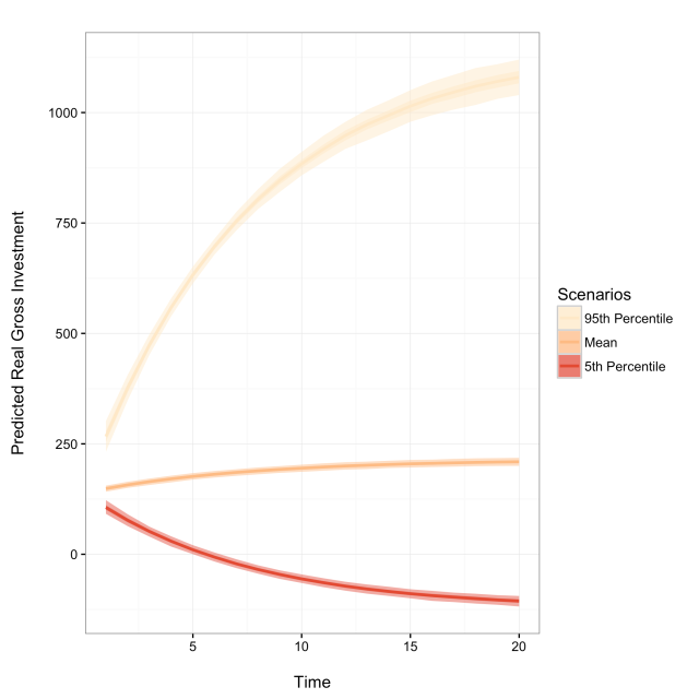
dynsimGG(Sim1)
We can make a number of aesthetic changes. The following code adds custom legend labels, the ‘orange- red’ color palette–denoted by OrRd–, and relabels the y-axis to create the following figure.
Labels
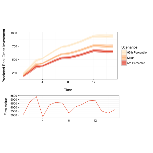
When plotting simulations with shock values another plot can be included underneath the main plot showing one shock variable’s fitted values. To do this use the shockplot.var argument to specify which variable to plot. Use the shockplot.ylab argument to change the y-axis label. For example, the following code creates the following figure:
dynsimGG(Sim2, leg.name = "Scenarios", leg.labels = Labels,
               color = "OrRd",
               ylab = "Predicted Real Gross Investment\n",
               shockplot.var = "mvalue",
               shockplot.ylab = "Firm Value")
Summary
We have demonstrated how the R package dynsim makes it easy to implement Williams and Whitten’s (2012) approach to more completely interpreting results from autoregressive time-series models where the effects of explanatory variables have both short- and long-term components. Hopefully, this will lead to more meaningful investigations and more useful presentations of results estimated from these relationships.
References
Baltagi, B. (2001). Econometric Analysis of Panel Data. Wiley and Sons, Chichester, UK.
De Boef, S. and Keele, L. (2008). Taking time seriously. American Journal of Political Science, 52(1):184–200.
Gandrud, C. (2016). DataCombine: Tools for Easily Combining and Cleaning Data Sets. R package version 0.2.21.
Gandrud, C., Williams, L. K., and Whitten, G. D. (2016). dynsim: Dynamic Simulations of Autoregressive Relationships. R package version 1.2.2.
Grunfeld, Y. (1958). The Determinants of Corporate Investment. PhD thesis University of Chicago.
King, G., Tomz, M., and Wittenberg, J. (2000). Making the Most of Statistical Analyses: Improving Interpretation and Presentation. American Journal of Political Science, 44(2):347–361.
Neuwirth, E. (2014). RColorBrewer: ColorBrewer palettes. R package version 1.1-2.
Sievert, C., Parmer, C., Hocking, T., Chamberlain, S., Ram, K., Corvellec, M., and Despouy, P. (2016). plotly: Create Interactive Web Graphics via ‘plotly.js’. R package version 3.4.13.
StataCorp. (2015). Stata statistical software: Release 14.
Wickham, H. and Chang, W. (2015). ggplot2: An implementation of the Grammar of Graphics. R package version 1.0.1.
Williams, L. K. and Whitten, G. D. (2011). Dynamic Simulations of Autoregressive Relationships. The Stata Journal, 11(4):577–588.
Williams, L. K. and Whitten, G. D. (2012). But Wait, There’s More! Maximizing Substantive Inferences from TSCS Models. Journal of Politics, 74(03):685–693.