By Natalia S. Bueno and Guadalupe Tuñón
[Editor’s note: this post is contributed by Natalia Bueno and Guadalupe Tuñón.]
During the last decade, an increasing number of political scientists have turned to regression-discontinuity (RD) designs to estimate causal effects. Although the growth of RD designs has stimulated a wide discussion about RD assumptions and estimation strategies, there is no single shared approach to guide empirical applications. One of the major issues in RD designs involves selection of the “window” or “bandwidth” — the values of the running variable that define the set of units included in the RD study group. [i]
This choice is key for RD designs, as results are often sensitive to bandwidth size. Indeed, even those who propose particular methods to choose a given window agree that “irrespective of the manner in which the bandwidth is chosen, one should always investigate the sensitivity of the inferences to this choice. […] [I]f the results are critically dependent on a particular bandwidth choice, they are clearly less credible than if they are robust to such variation in bandwidths.” (Imbens and Lemieux, 2008,p. 633) Moreover, the existence of multiple methods to justify a given choice opens the door to “fishing” — the intentional or unintentional selection of models that yield positive findings (Humphreys, Schanchez de la Sierra, and van der Vindt, 2013).
In this note, we propose a simple graphical way of reporting RD results that shows the sensitivity of estimates to a wide range of possible bandwidths.[ii] By forcing researchers to present results for an extensive set of possible choices, the use of these plots reduces the opportunities for fishing, complementing existing good practices in the way in which RD results are presented. Some empirical applications of RD designs have presented their results using plots that are in some ways similar to the ones we propose. However, this note explores the virtues of the plots more systematically (e.g., in connection with balance tests and the discussion of the RD estimator) and provides code so that scholars can adapt them to their own applications. The following paragraphs describe how RD results are usually reported in two top political science journals and the ways in which the graphs we propose can improve on current practices. An R function to construct these plots for a wide set of applications is publicly available on the online Appendix.
Reporting RD Analyses: Current Practice
How do political scientists report the results of regression-discontinuity designs? We reviewed all papers using RDDs published in the American Political Science Review and American Journal of Political Science. We surveyed these papers and coded (1) their choice of estimators, (2) whether they present any type of balance test and, (3) if they do, the window(s) chosen for this.
Out of a total of twelve RD papers published in these journals, five report results using a single estimator.[iii] Four articles present results for a single window — usually the full sample. The remaining papers present results using multiple windows, but the number and selection of windows are neither systematic nor extensive.[iv] Seven papers present some type of balance test, but while researchers often report their main results using a handful of windows, they do not report balance tests for different windows to the same extent.[v]
A Graphical Alternative: An Example
We use electoral data from the U.S. House of Representatives from 1942 to 2008 collected by Caughey and Sekhon (2011) and a regression discontinuity design examining incumbency advantage to illustrate how a researcher can use plots to present RD results in a transparent and systematic way. This application has two advantages for illustrating the use of these plots. First, close-race electoral regression-discontinuity designs are one of the main applications of this type of design in political science — we are thus presenting the plot in one of the most used RDD setups, although researchers can use this type of graph in all sorts of RD designs. Second, the use of close-race RDDs to measure the effect of incumbency advantage has sparked a vigorous debate about the assumptions and validity of these designs in particular settings. Using this application allows us to show an additional advantage of the plots we propose: tests of balance and other types of placebo tests.
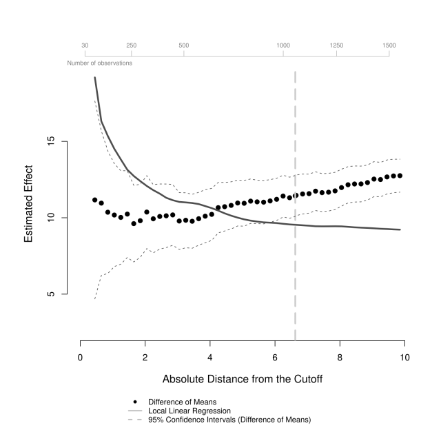
Figure 1 plots the estimates of local average treatment effects as a function of the running variable, here vote margin. For example, the first solid back circle represents the average difference in vote share between an incumbent party that won by 0.45% or less and an incumbent party that lost by 0.45% or less is about 11 percentage points. It also reports the average difference in vote share between incumbent parties that won and lost by sequential increases of 0.2% in vote margin between 0.45% to 9.85%. Figure 1 has an additional feature: the solid gray line represents the results using an additional estimator that enables us to compare the effects estimated from two different estimators, across different windows, in the same plot. In this case, we present the estimated effects of party incumbency on vote share using a local linear regression with a triangular kernel, across different bandwidths. Researchers could use different estimators, such as a polynomial regression model.[vi] Note, however, that the black circles and the solid gray line represent different quantities. The black circles represent estimates of the average causal effect for the RD study group . The difference of means estimator (
) — the difference between average vote share for an incumbent party minus the average vote share for a non-incumbent party — is unbiased for the average causal effect (
), represented in equation (1).[vii] The gray line presents estimates of the average causal effect precisely at the point of discontinuity (
). We fit a local linear regression with a triangular kernel, within the RDD bandwidth, to estimate this limit parameter (
), represented in equation (2).[viii]
(1)
(2)

Figure 1: Mean vote share difference between winners and losers by Democratic margin of victory in previous election, U.S. House of Representatives from 1942 to 2008.
Note: Dashed gray line at the optimal bandwidth estimated by the method of Imbens and Kalyanaraman (2011). Difference of means is the average difference in vote share for an incumbent party minus the average vote share for a non-incumbent party. The local linear regression uses a triangular kernel.
The key part of the plotting function is the section that produces the estimate for each window. For this, we first pre-specify functions for each estimator. For example, for the difference of means we have:[ix]
#Difference of mean (using OLS with robust standard errors)domfunction(rescaled, treat, outcome){modellm(outcome~treat)estNAest[1]est[2]sqrt(diag(vcovHC(model,type="HC3"))[2])return(est)}
We then include a loop which takes a window value and subsets the data to keep only the observations within that window.
estsmatrix(NA,length(windows),3)#object to store loop outputfor(iin1:length(windows)){# select datatempas.data.frame(data[abs_running
We take this subset of the data to calculate the estimates of interest for that window, here the difference of means. The plot requires that we calculate both the point estimates and the confidence intervals. In these figures, confidence intervals are calculated using a normal approximation and unequal variances are assumed for standard errors in the treatment and control groups. If the researcher wanted to include an additional estimator, the calculation of the estimate for a particular window would also be included in the loop.[x]
ests[i,1:2]with(temp,dom(rescaled=rescaled, treat=treat,outcome=outcome))if(ci=="95") CIcbind(ests[,1]+1.96*ests[,2],ests[,1]-1.96*ests[,2])if(ci=="90") CIcbind(ests[,1]+1.64*ests[,2],ests[,1]-1.64*ests[,2])
As expected, the confidence intervals in figure 1 become increasingly smaller for results associated with larger vote margins because the number of observations is larger. This increase in the number of observations associated with larger windows can also be reported in the plot, which we do in the upper axis of figure 1. To include the number of observations as a function of window size, we order the observed values of the outcome of interest according to their value for the running variable and allow the user to set the different number of observations that she would want to show in the plot. We calculate the number of observations at the specified values of the running variable — then, we add the number of observations to an upper axis in the plot.
# as an argument in the function, the user defines nr_obs_lab,# the labels for the number of observations she would like to include# in the plot# ordering the vata by the values for the running variabledataas.data.frame(data[order(abs_running),])if(nr_obs==T) {# binding the labels with the corresponding value for the running variablenr_obs_labcbind(nr_obs_lab, data$abs_running[nr_obs_lab])}# Finally, we include an additional axis in the plotaxis(3, at=c(nr_obs_lab[,2]), labels=c(nr_obs_lab[,1]), cex=.6, col="grey50",lwd = 0.5, padj=1, line=1, cex.axis=.7, col.axis="grey50")mtext("Number of observations", side=3, col="grey50", cex=.7, adj=0)
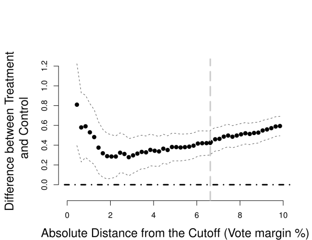
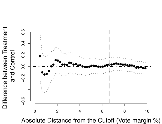
Figure 2 follows the same logic described for Figure 1 but reports balance tests: each plot shows the effects of incumbency on a pre-treatment covariate as a function of the running variable.[xi] These plots allow for an extensive examination of the sensitivity of balance to different windows, reporting the magnitude of the difference between treatment and control and its confidence interval. For a given identifying assumption (such as continuity of potential outcomes or as-if random assignment near the threshold), Figures 1 and 2 help the reader to evaluate whether or not — or for which window — these assumptions are plausible.
(a) Democratic Win in (b) Voter Turnout %
Figure 2: Tests for balance: Standardized difference of means of pre-treatment covariates by Democratic margin of victory (95% confidence intervals), U.S. House of Representatives, from 1942 to 2008.
Note: Dashed gray line at the optimal bandwidth estimated by the method of Imbens and Kalyanaraman (2011). Difference of means is the average difference in vote share for an incumbent party minus the average vote share for a non-incumbent party.
For instance, panel (a) in Figure 2, reports the difference in previous Democratic victories between the incumbent and non-incumbent party and shows a large imbalance, strikingly larger for smaller windows — a point made by Caughey and Sekhon (2011). Panel (b) in Figure 2 shows the difference in voter turnout between treatment and control districts. For the entire set of windows covered by the plot the difference is never statistically different from zero, suggesting that the groups are balanced in terms of this covariate. Note that the size of the difference between treatment and control is much smaller in panel (b) than in panel (a) — also, relatively to the size of the effect of incumbency, the imbalance in panel (a) is substantial.[xii]
For ease of presentation, here we present plots for only two pre-treatment covariates. However, analysts should be encouraged to present plots for all pre-treatment covariates at their disposal.[xiii] Some plots may be more informative than others, for instance, because some pre-treatment covariates are expected to have a stronger prognostic relationship to the outcome. However, presentation of balance plots for the full set of available pre-treatment covariates may reduce opportunities for intentional or unintentional fishing.
Concluding Remarks
We believe that these simple plots are a useful complement to the standard way in which scholars report results and balance tests from regression-discontinuity designs. They provide a simple visual comparison of how different estimators perform as a function of different windows, communicating the robustness of the results. Moreover, using these plots both for analysis of effects and placebo tests enables an informal visual inspection of how important confounders may be, relative to the size of the effect — this is particularly informative when researchers use pre-treatment values of the outcome variable as a placebo test. However, researchers may also compare the size of treatment effects relative to other placebo tests by using standardized effect sizes across different windows, so that the scale of all plots is comparable. In summary, these plots improve the communication of findings from regression-discontinuity designs by showing readers the results from an extensive set of bandwidths, thus reducing researchers’ latitude in presentation of their main findings and increasing the transparency of RD design applications.
Footnotes
[i] Formally, the window is an interval on the running variable, , containing the cutoff value
. The analysis then focuses on all observations with
within this interval. Scholars have developed numerous tools to determine the right window for a given application and estimator (Imbens and Lemieux, 2008; Imbens and Kalyanaraman, 2011, Calonico, Cattaneo and Titiunik, 2015).
[ii] This choice is posterior to defining the estimand and choosing an estimator for the causal effect of treatment. While the plots we propose focus on presenting the sensitivity of results to bandwidth choice, we also show how they can be used to explore the sensitivity of results to these other choices. For discussions of estimands in RD design see Duning (2012) and Calonico et al. (2015).
[iii] Polynomial regression is the most popular model: nine papers use a type of polynomial regression, five employ a local linear regression, and three use a difference of means (via OLS). Only one presents results using all three estimators.
[iv] Gerber and Hopkins (2011), Fewerda and Miller (2014) and Eggers et al. (2015) are exceptions—they show the robustness of the main result using plots similar to the one we suggest here.
[v] All of the papers that use local linear regressions also use a type of standard procedure to choose the “optimal” bandwidth — either Imbens and Lemieux (2008) or Imbens and Kalyanaraman (2011).
[vi] We present an example of this plot using an fourth-degree polynomial regression in Figure A.1 available at the online Appendix.
[vii] See Dunning (2012) and Bueno, Dunning, and Tuñón (2014) for a discussion and proofs.
[viii] We use the terms “window” and “bandwidth” interchangeably, since both denote the values of the running variable () that define the set of units included in the RD study group. However, in local linear regression with kernel smoothers, bandwidth refers to the width of the kernel.
[ix] Note that we compute the difference of means by regressing the outcome variable on a dummy for treatment assignment, with robust standard errors allowing for unequal variances, which is algebraically equivalent to the t-test with unequal variances.
[x] Our plot, and the accompanying documented R code, is flexible to incorporating different ways of estimating standard errors and constructing confidence intervals. For a detailed discussion of standard errors and confidence intervals in RD designs, see Calonico et al. (2015).
[xi] In these plots, we chose to omit the axis with the number of observations because even though there are different rates of missing observations for covariates, the number of observations for the windows we were mostly interested in did not vary substantially from those in Figure 1.
[xii] See Figure A.2 in the online Appendix for a the standardized effect of incumbency on vote share.
[xiii] An extensive set of balance plots for pre-treatment covariates in Caughey and Sekhon (2011) can be found in Figure A.3 of the online Appendix.
References
Bueno, Natália S., Thad Dunning and Guadalupe Tuñón. 2014. “Design-Based Analysis of Regression Discontinuities: Evidence From Experimental Benchmarks.” Paper Presented at the 2014 APSA Annual Meeting.
Calonico, Sebastian, Matias D Cattaneo and Rocio Titiunik. 2015. “Robust nonparametric confidence intervals for regression-discontinuity designs.” Econometrica 86(2):2295–2326.
Caughey, Devin and Jasjeet S. Sekhon. 2011. “Elections and the Regression Discontinuity Design: Lessons from Close US House Races, 1942–2008.” Political Analysis 19(4):385–408.
Dunning, Thad. 2012. Natural Experiments in the Social Sciences: a Design-Based Approach. Cambridge University Press.
Eggers, Andrew C., Olle Folke, Anthony Fowler, Jens Hainmueller, Andrew B. Hall and James M. Snyder. 2015. “On The Validity Of The Regression Discontinuity Design For Estimating Electoral Effects: New Evidence From Over 40,000 Close Races.” American Journal of Political Science 59(1):259–274.
Ferwerda, Jeremy and Nicholas L. Miller. 2014. “Political Devolution and Resistance to Foreign Rule: A Natural Experiment.” American Political Science Review 108(3):642–660.
Gerber, Elisabeth R. and Daniel J. Hopkins. 2011. “When Mayors Matter: Estimating the Impact of Mayoral Partisanship on City Policy.” American Journal of Political Science 55(2):326–339.
Humphreys, Macartan, Raul Sanchez de la Sierra and Peter van der Windt. 2013. “Fishing,
Commitment, and Communication: A Proposal for Comprehensive Nonbinding Research
Registration.” Political Analysis 21(1):1–20.
Imbens, Guido and Karthik Kalyanaraman. 2011. “Optimal Bandwidth Choice for the Regression Riscontinuity Estimator.” The Review of Economic Studies 79(3):933–959.
Imbens, Guido W. and Thomas Lemieux. 2008. “Regression Discontinuity Designs: A guide to Practice.” Journal of econometrics 142(2):615–635.


